June 5th, 2025
New
Improved
Release 2025.06.05
We've given our dashboard a significant upgrade to bring even more powerful analytics right to your fingertips!
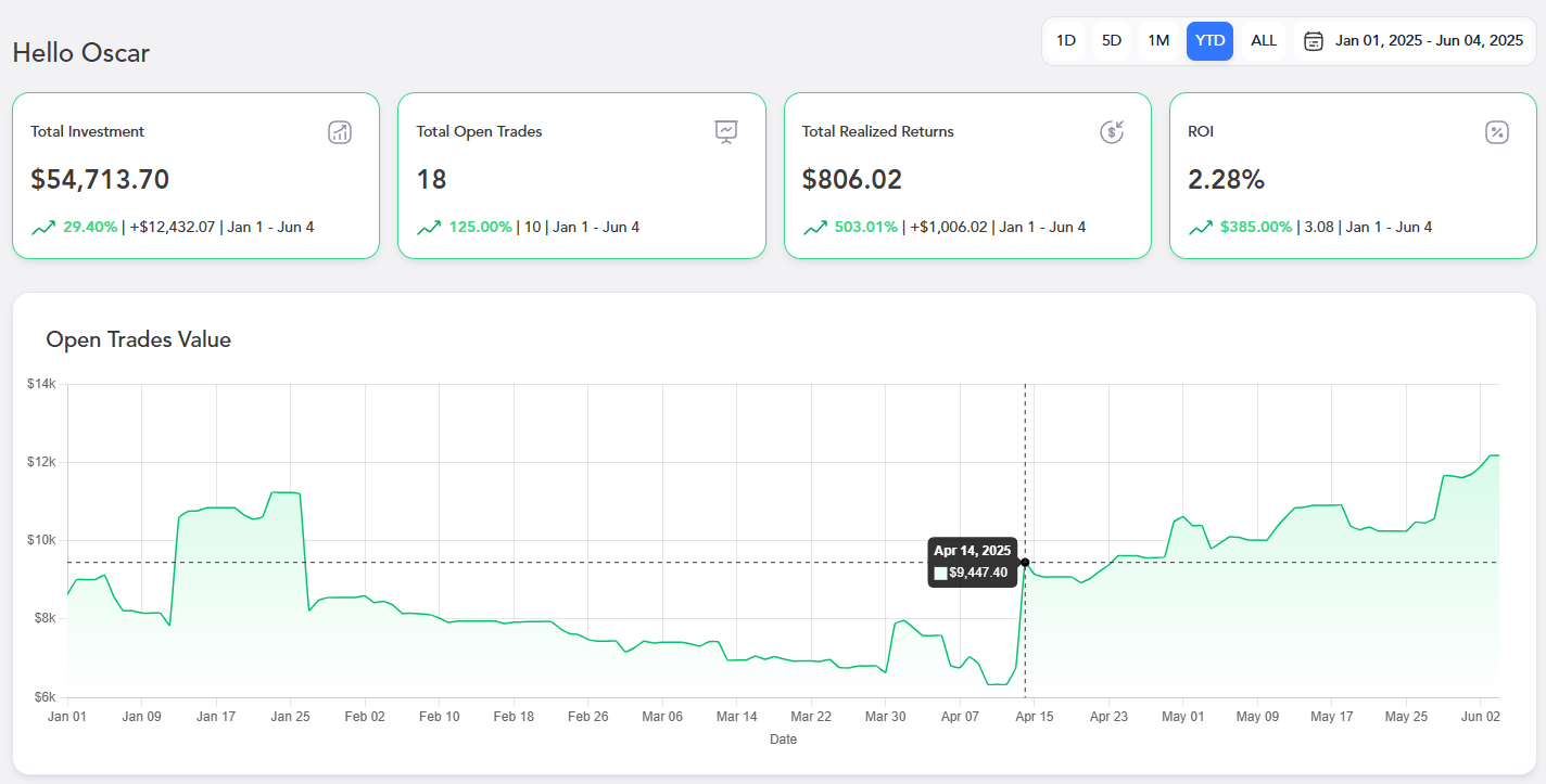
Enhanced Summary Cards
What: We've updated our main summary cards to provide you with a clearer, more immediate overview of your trading activity. You'll now see:
Total Investment: The total money you've put into your long-position trades within your selected date range.
Total Open Trades: The current count of your active, open trades within your selected date range.
Total Realized Returns: The sum of all profits from trades you've closed within your selected date range.
ROI (Return on Investment): The percentage return on your capital for trades closed within your selected date range.
Why: These enhancements give you a quick, at-a-glance understanding of your capital deployment, active positions, profitability, and the efficiency of your closed trades. It's about empowering you with immediate, digestible insights into your overall performance.
Live Open Trades Value Graph
What: We've introduced a brand-new Open Trades Value graph directly on your dashboard. This interactive graph is connected to live market data, showing you the fluctuating value of your open positions over time.
Why: This feature provides unparalleled transparency into your current market exposure. You can instantly visualize how your open trades are performing, helping you make more informed decisions about managing your active positions. It's about giving you a dynamic, visual representation of your portfolio's real-time movements.
New: Cumulative Profit and Profit by Month Graphs

What: We've introduced two powerful new visual tools to your dashboard: the Cumulative Profit graph and the Profit by Month graph.
The Cumulative Profit graph dynamically tracks your total realized profits (or losses) over time, with the area filled in green for gains and red for losses.
The Profit by Month graph provides a bar chart breakdown of your Total Realized Returns for each of the last six months, clearly showing profitable months in green and unprofitable ones in red.
Why: These additions give you unprecedented insight into your long-term and recent trading performance. You can now easily visualize how your profits accumulate over time and pinpoint exactly which months have been most impactful to your bottom line. It's about providing you with clear, actionable visuals to better understand your trading journey.