June 10th, 2026
New
Improved
Product Update: New Multi-Factor Authentication (MFA) & Enhanced Account Protection
We've launched Multi-Factor Authentication (MFA) to add a stronger layer of protection to your account, particularly when connecting external financial institutions.
Progressive security
What: MFA is introduced at the moments it matters most. You can explore Orizon's manual tools without MFA enabled, but it becomes required before linking any external brokerage account.
Why: We want new users to get familiar with the platform without unnecessary friction, while ensuring that any real-time connection to your financial accounts is fully secured before it's established.
30-day device trust
What: When completing MFA verification, you can check “Trust this device for 30 days” to skip code entry on that browser for 30 days.
Why: Security shouldn't mean re-verifying every time you open your dashboard. Device trust lets you move quickly on familiar devices while keeping your account protected. Verification is required again once the 30-day window expires.
Security settings panel
What: A new Security section in Account Settings lets you manage trusted devices and connected brokerages. The "Clear Trusted Devices" option immediately revokes trusted status across all browsers.
Why: If you ever log in from a shared computer or think a device may be compromised, you can lock down all active sessions instantly without needing to contact support.
A Note on Financial Connections
All external account connections on Orizon are strictly read-only. Our software securely retrieves holdings and historical metrics for visualization; we cannot place trades, move funds, or access your direct financial provider credentials.
Looking Ahead
Our commitment to transparency and data integrity is foundational to how we build. As we continue to scale our core systems, we will regularly share our technical and governance milestones with the community. More infrastructure and security updates will be rolled out as they are deployed to production.
May 29th, 2026
Improved

Security & Trust Infrastructure Hardening
At Orizon Analytics, providing disciplined portfolio insights requires an equally elite commitment to operational excellence. We have rolled out a comprehensive update to our system transparency framework and finalized the formal governance policies that protect our platform infrastructure.
Public Status Page Update
What: We have deployed an update to our public-facing Status Page (powered by Better Stack) to optimize real-time visibility into platform performance and historical uptime.
Why: Trust is built on transparency. Users can reliably verify the platform's active health and operational status at any time, ensuring total clarity around system availability.
Formalization of Infrastructure Monitoring Governance
What: We have finalized and adopted the formal corporate governance frameworks managing our real-time server telemetry and automated alerting infrastructure.
Why: Documenting and formalizing these internal monitoring workflows ensures our security leadership and engineering team operate under strict, auditable protocols to proactively maintain platform optimization, speed, and stability.
Looking Ahead
Our commitment to transparency and data integrity is foundational to how we build. As we continue to scale our core systems, we will regularly share our technical and governance milestones with the community. More infrastructure and security updates will be rolled out as they are deployed to production.
General Disclosures for Product Updates
This Release Updates page is an advertisement of Orizon Analytics, LLC ("Orizon"), an SEC-registered investment adviser. Registration does not imply a certain level of skill or training.
Nature of the Service: Orizon provides non-discretionary portfolio analytics and investment recommendations. We do not provide financial planning, tax advice, or discretionary management. All investments carry risks, including the potential loss of principal. The Echo AI Agent is an analytical tool and does not possess the capacity to consider a client's individual financial situation or risk tolerance; users should not rely solely on AI-generated outputs for investment decisions.
Hypothetical & Illustrative Data: Any charts, graphs, or "Snapshot" values shown are for illustrative purposes only.
General Disclaimer: The information provided here is not intended to be personalized investment advice. Any discussion of potential benefits from using our features must be weighed against the material risks of investing in securities. Past performance is not a guarantee of future results. For full details on our services, fees, and conflicts of interest, please consult our Form ADV Part 2A Brochure and Form CRS available on our website.
April 16th, 2026
New
Improved
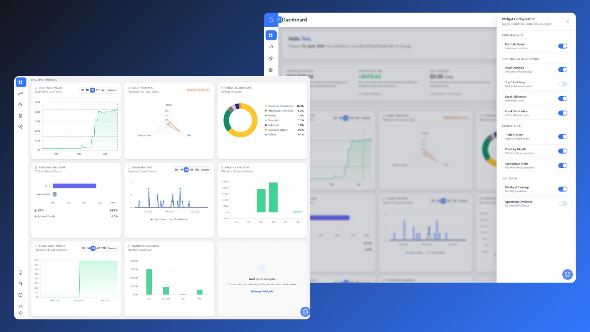
Enhancing Your Analytical Workflow: Personalized & Customizable Dashboard
This update represents the next phase of how you interact with your financial data within Orizon.
We have transitioned from static summaries to a Modular Customizable Framework, designed to provide a personalized experience that aligns with your specific monitoring and analytical objectives.
The New Modular Customizable Framework
What: A transition from a fixed overview to a customizable, component-based analytical dashboard.
Why: To ensure your dashboard reflects your unique priorities. Whether you are focused on identifying daily market movements, tracking passive income growth, or evaluating sector concentration, this flexibility allows you to highlight the data that is most relevant to your current strategy.
Personalization & Control via Configuration Slide-Out
What: An on-demand menu for toggling analytical modules in real-time.
Why: To allow for seamless adjustments without losing your place. By visualizing layout changes as they happen, you can efficiently curate your workspace to match your focus for the day, with the confidence that your settings will persist between sessions.
The Widget Gallery: This expanded suite of analytical tools is designed to provide specific clarity based on your monitoring style:
Portfolio Value: Gain perspective on your long-term wealth journey with a comprehensive historical equity curve.
Asset Analysis: Identify structural balance across Stocks, ETFs, and Mutual Funds at a glance using radar visualization.
Top 5 Holdings: Quickly monitor your largest financial exposures to manage concentration risk effectively.
Stock Allocation: Visualize sector diversification to ensure your equity strategy remains aligned with your risk tolerance.
Fund Distribution: Evaluate the weight of your indirect investments to better understand your core portfolio strategy.
Trade History: Review your trading velocity to determine if you are in an accumulation or consolidation phase.
Profit by Month & Cumulative Profit: Contextualize your realized performance over both short-term and long-term horizons.
Dividend Earnings & Upcoming Dividends: Monitor historical income trends and estimate potential cash flow for better liquidity planning.
Direct Insights with Echo AI
What: Integration between your dashboard metrics and the Echo AI Assistant.
Why: To move from data collection to data interpretation efficiently. Instead of manually cross-referencing charts, you can ask Echo to:
“Identify today's top performers.”
“Compare quarterly dividend growth."
This allows you to receive narrative overviews that assist in contextualizing your portfolio’s evolution through natural conversation.
General Disclosures for Product Updates
This Release Updates page is an advertisement of Orizon Analytics, LLC ("Orizon"), an SEC-registered investment adviser. Registration does not imply a certain level of skill or training.
Nature of the Service: Orizon provides non-discretionary portfolio analytics and investment recommendations. We do not provide financial planning, tax advice, or discretionary management. All investments carry risks, including the potential loss of principal. The Echo AI Agent is an analytical tool and does not possess the capacity to consider a client's individual financial situation or risk tolerance; users should not rely solely on AI-generated outputs for investment decisions.
Hypothetical & Illustrative Data: Any charts, graphs, or "Snapshot" values shown are for illustrative purposes only.
General Disclaimer: The information provided here is not intended to be personalized investment advice. Any discussion of potential benefits from using our features must be weighed against the material risks of investing in securities. Past performance is not a guarantee of future results. For full details on our services, fees, and conflicts of interest, please consult our Form ADV Part 2A Brochure and Form CRS available on our website.
March 26th, 2026
New
Improved
Fixed
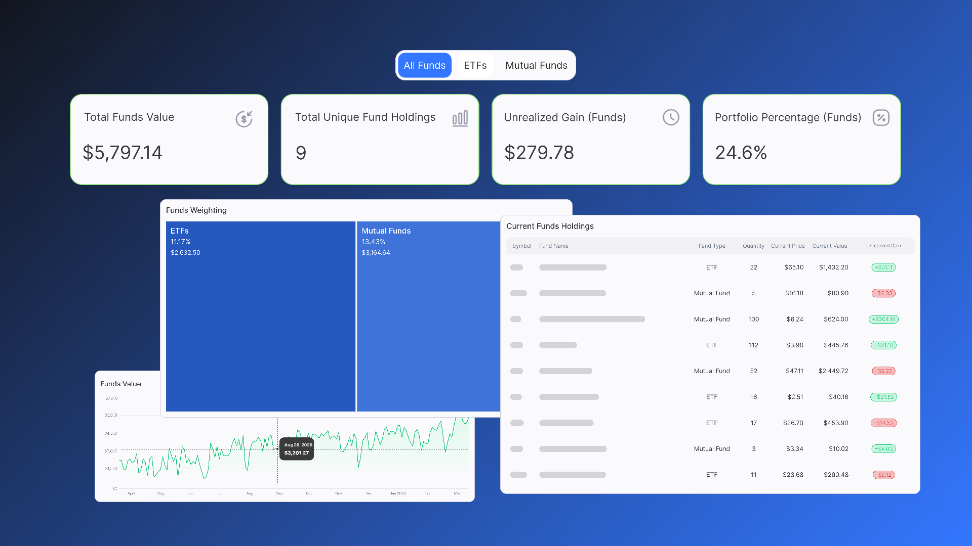
Support for ETFs and Mutual Funds
We are pleased to share our latest update, which introduces expanded tracking capabilities for ETFs and Mutual Funds, providing additional ways to categorize and analyze your portfolio.
With this update, we have introduced dedicated spaces for Stocks, ETFs, and Mutual Funds, allowing for a more organized view of your total holdings.
Alongside these, we’ve also refreshed the analytical view for your Individual Stocks.
New: Dedicated Funds Analysis Page
What: We have launched a dedicated Funds page to isolate and analyze your ETF and Mutual Fund holdings. This includes a new Funds Selector Slider to toggle between asset classes, interactive Performance Graphs, and a Portfolio Fund Composition Treemap.
Why: Previously, Orizon focused primarily on individual equities. By providing a dedicated space for ETFs and Mutual Funds, you can now analyze the diversified portion of your portfolio independently. This allows you to monitor fund-specific growth and allocation metrics without the volatility of individual stock data.
Enhanced: Stocks Allocation Summary
What: We have updated the Stocks page with a new suite of Stocks Summary Cards. These cards provide a snapshot of your total equity market value, unique ticker count, and estimated unrealized gains.
Why: To ensure analytical consistency across the platform, the Stocks and Funds page summary cards and are now aligned on the type of data shown. The new Portfolio Percentage metric is designed to show you what percentage of your total Orizon portfolio is held in individual stocks compared to your entire Orizon Analytics tracked holdings.
Improvements 🛠
Refined Dashboard & Navigation
What: We’ve streamlined the primary dashboard data presentation and refined the onboarding experience.
Why: These UI updates are intended to provide a cleaner, more intuitive experience when navigating between your different analytical pages. Additionally, this update is in a series of planned enhancements to make your landing experience more intuitive and your data easier to interpret.
General Disclosures for Product Updates
This Release Updates page is an advertisement of Orizon Analytics, LLC ("Orizon"), an SEC-registered investment adviser. Registration does not imply a certain level of skill or training.
Nature of the Service: Orizon provides non-discretionary portfolio analytics and investment recommendations. We do not provide financial planning, tax advice, or discretionary management. All investments carry risks, including the potential loss of principal. The Echo AI Agent is an analytical tool and does not possess the capacity to consider a client's individual financial situation or risk tolerance; users should not rely solely on AI-generated outputs for investment decisions.
General Disclaimer: The information provided here is not intended to be personalized investment advice. Any discussion of potential benefits from using our features must be weighed against the material risks of investing in securities. Past performance is not a guarantee of future results. For full details on our services, fees, and conflicts of interest, please consult our Form ADV Part 2A Brochure and Form CRS available on our website.
February 3rd, 2026
New
Improved

Introducing Orizon Echo AI
We are excited to share our latest updates, designed to give you more control, better clarity, and a smarter way to interact with your investment data.
Orizon Echo AI Agent
What: We are introducing the Orizon Echo AI Agent, a conversational assistant powered by the Anthropic Claude LLM that integrates directly with your Orizon portfolio data. It allows you to ask natural language questions about your holdings, trade history, and dividend data.
Why: To bridge the gap between complex datasets and rapid insight retrieval. While our charts and tables remain essential for high-precision deep dives, Echo AI allows you to talk with your data to get instant answers to questions like, "What was my top-performing sector this quarter?" or "How much dividend income did I receive last year?" It is a descriptive, fact-based tool designed to complement our visual reports with conversational speed.
Note: Echo AI uses secure, read-only authentication. It is an analytical assistant, not a prediction model.
A Note on AI Transparency & Safety
As we integrate AI into your financial workflow, your security and data integrity remain our top priorities.
Fiduciary Oversight: Orizon Analytics maintains strict oversight of the data provided via Echo AI. However, we encourage you to verify AI-generated insights against your primary Orizon charts and official statements.
Hallucination Risk: While we have implemented technical safeguards, AI technology can occasionally produce errors. Providing detailed, specific prompts helps ensure the highest level of accuracy for your analysis.
Analytical Tool: Echo AI does not provide legal, tax, or accounting advice. It is here to help you understand the "what" and "how" of your current performance.
Improvements 🛠
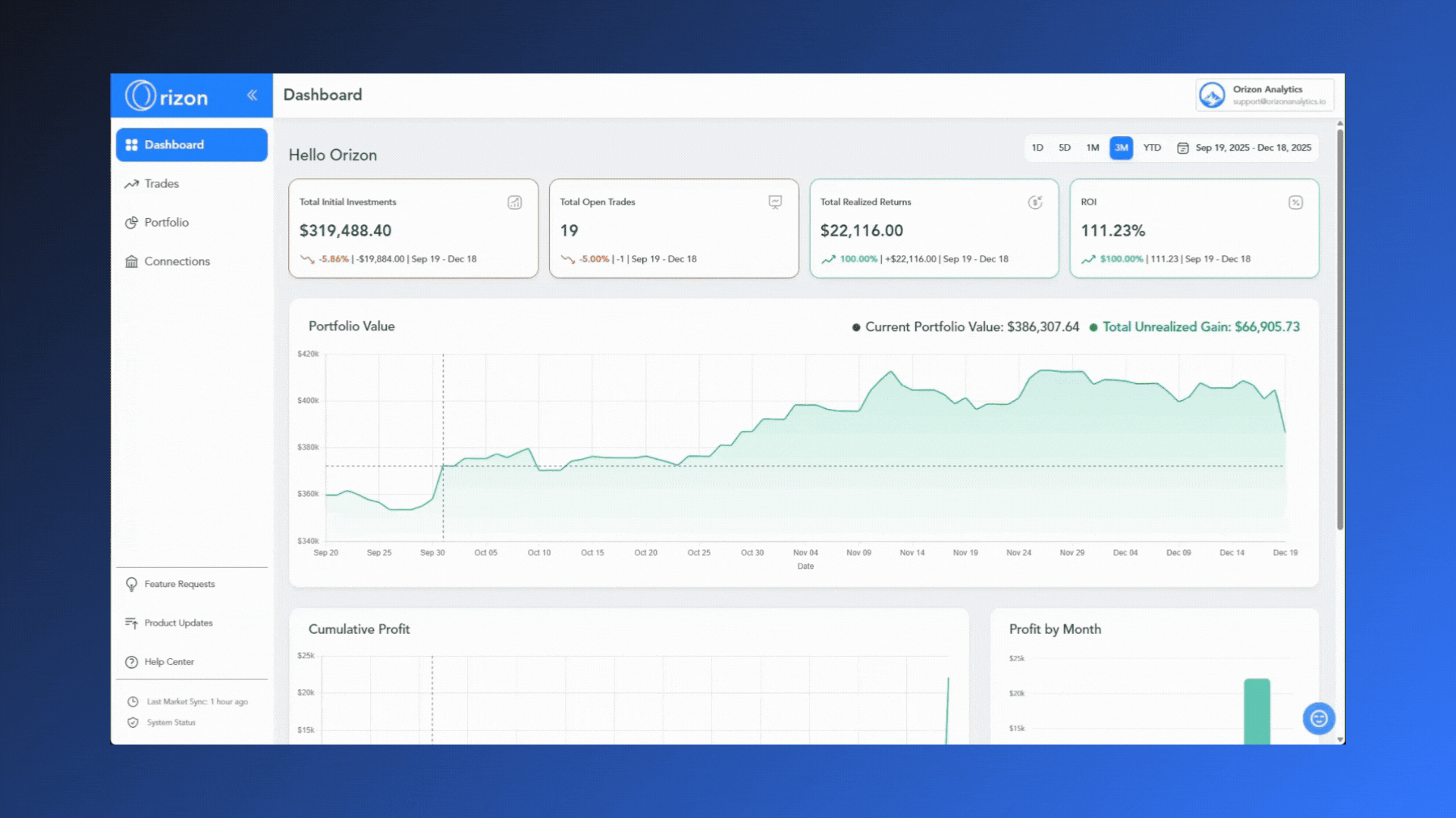
Dashboard Streamlining
What: we have streamlined the data presentation on the main Dashboard to provide a cleaner, more focused overview of your portfolio.
Why: To reduce visual noise and ensure that your most critical performance metrics are the first thing you see. This update is the first step in a series of planned enhancements to make your landing experience more intuitive and actionable.
General Disclosures for Product Updates
This Release Updates page is an advertisement of Orizon Analytics, LLC ("Orizon"), an SEC-registered investment adviser. Registration does not imply a certain level of skill or training.
Nature of the Service: Orizon provides non-discretionary portfolio analytics and investment recommendations. We do not provide financial planning, tax advice, or discretionary management. All investments carry risks, including the potential loss of principal. The Echo AI Agent is an analytical tool and does not possess the capacity to consider a client's individual financial situation or risk tolerance; users should not rely solely on AI-generated outputs for investment decisions.
General Disclaimer: The information provided here is not intended to be personalized investment advice. Any discussion of potential benefits from using our features must be weighed against the material risks of investing in securities. Past performance is not a guarantee of future results. For full details on our services, fees, and conflicts of interest, please consult our Form ADV Part 2A Brochure and Form CRS available on our website.
December 19th, 2025
Improved
Fixed
Connection & Interface Improvements
We’ve refined our brokerage onboarding process and polished the app's navigation to ensure a smoother, more reliable user experience.
Improved Brokerage Onboarding
What: We’ve resolved issues preventing certain brokerages from establishing a stable connection via SnapTrade. Additionally, we enhanced the user feedback and status updates provided during the connection workflow.
Why: This update ensures a higher success rate when linking your accounts and eliminates guesswork. By providing clearer guidance during the setup process, you’ll know exactly where you are in the connection sequence, leading to a more transparent and frustration-free onboarding experience.
Navigation & Layout Fixes
What: We fixed a persistent UI bug across multiple pages that caused "double scrollbars" to appear during navigation.
Why: This fix cleans up the interface and ensures that scrolling is smooth and intuitive. By removing these layout inconsistencies, you solely focus on your data without visual distractions.
General Disclosures for Product Updates
This Release Updates page is an advertisement of Orizon Analytics, LLC (Orizon), an SEC-registered investment adviser.
1. Nature of the Service: Orizon provides non-discretionary portfolio analytics and investment recommendations. We do not provide financial planning, tax advice, or discretionary management. All investments carry risks, including the potential loss of principal.
2. Beta Limitations: The Early Access Beta version of the platform and any related features discussed here are under development and may contain bugs, errors, or significant limitations. Features listed on this page are subject to change, delay, or cancellation without notice. You should not rely on the performance or availability of any Beta feature when making investment decisions.
3. General Disclaimer: The information provided here is not intended to be personalized investment advice. Any discussion of potential benefits from using our features must be weighed against the material risks of investing in securities. For full details on our services, fees, and conflicts of interest, please consult our Form ADV Part 2A Brochure and Form CRS available on our website.
November 17th, 2025
New
Improved
Fixed
Dividend Tools & Account Sync Performance
We've deployed significant updates to enhance your dividend analysis tools and ensure your portfolio data is accurate from the moment you record a new trade.
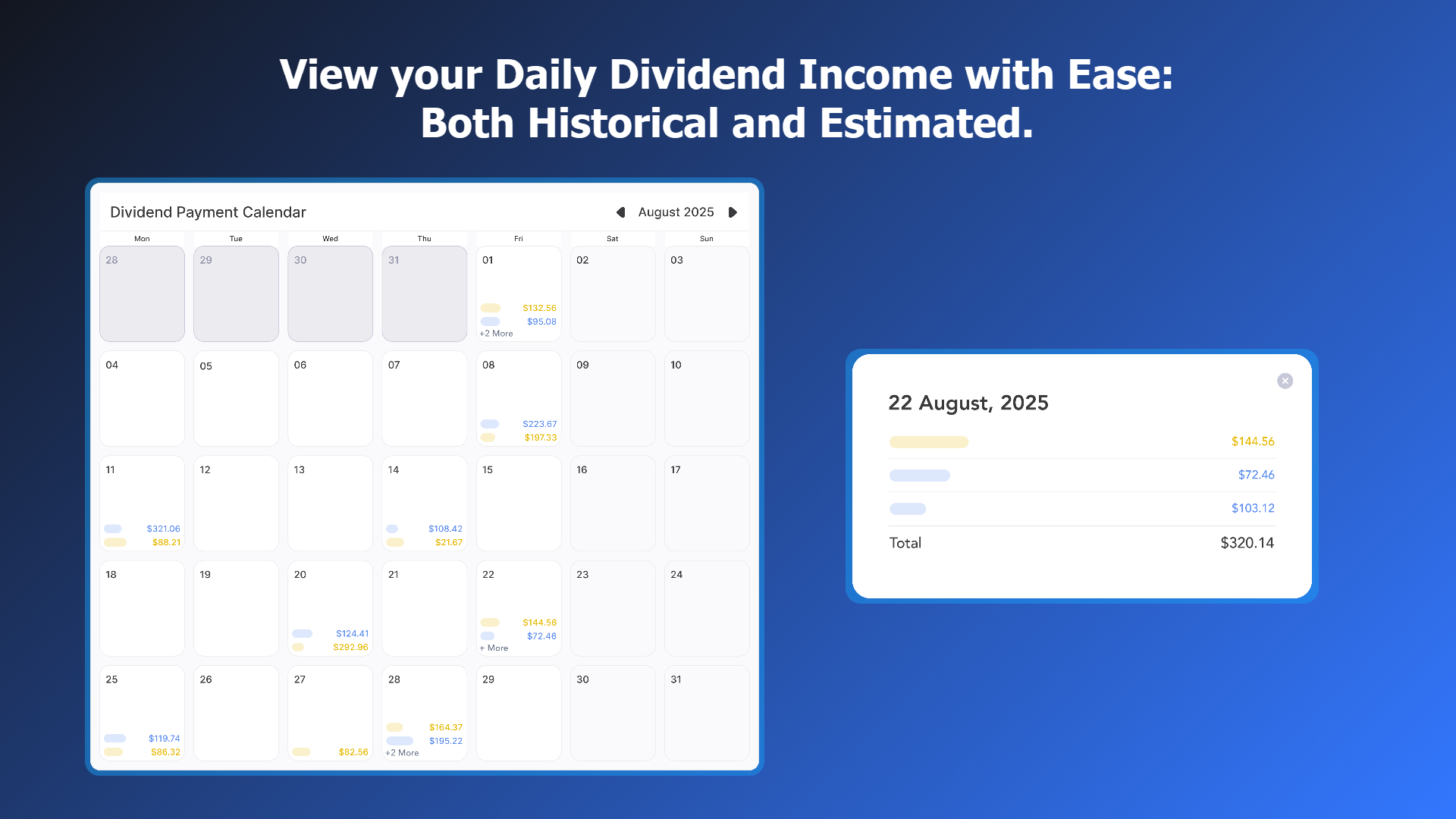
New Interactive Dividend Calendar
What: We've introduced a powerful Interactive Dividend Payment Calendar in the Portfolio section (under the Dividend Income tab). This calendar displays a comprehensive historical and estimated schedule of your dividend income.
Visualization: It clearly marks the amount with Earned, Announced, and Forecast dividends.
Detailed View: Clicking any specific date opens a modal showing a detailed, sorted list of all dividend events for that day, including the total amount.
Navigation: You can easily navigate month-to-month or jump to a specific month/year, restricted dynamically from your earliest earned dividend up to December of the next year.
Why: This feature provides the easiest way to visually track your daily dividend income schedule, giving you an immediate and accurate overview for cash flow planning.
Bug Fix🐞
Sync Update on Trades Data
What: We've implemented an update on the API price fetching process when any new trade is recorded (both manual and brokerage-synced).
Why: Previously, new trades sometimes displayed inaccurate initial profit/loss because they relied on the previous day's market sync price. Now, when a trade is added, the system pulls the most current price (or uses the executed trade price for brokerage transactions) to calculate the Current Value and Unrealized Gain. This ensures the data in your Current Positions table is accurate from when the trade is initiated.
General Disclosures for Product Updates
This Release Updates page is an advertisement of Orizon Analytics, LLC (Orizon), an SEC-registered investment adviser.
1. Nature of the Service: Orizon provides non-discretionary portfolio analytics and investment recommendations. We do not provide financial planning, tax advice, or discretionary management. All investments carry risks, including the potential loss of principal.
2. Beta Limitations: The Early Access Beta version of the platform and any related features discussed here are under development and may contain bugs, errors, or significant limitations. Features listed on this page are subject to change, delay, or cancellation without notice. You should not rely on the performance or availability of any Beta feature when making investment decisions.
3. General Disclaimer: The information provided here is not intended to be personalized investment advice. Any discussion of potential benefits from using our features must be weighed against the material risks of investing in securities. For full details on our services, fees, and conflicts of interest, please consult our Form ADV Part 2A Brochure and Form CRS available on our website.
October 14th, 2025
Improved
Fixed
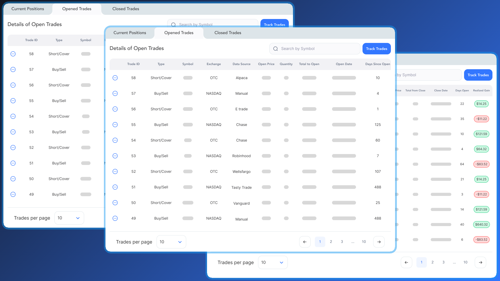
Performance and UI Improvements
We've rolled out several updates to enhance the speed, usability, and visual consistency across the platform, particularly on the Trades page.
Faster Loading for Trade Tables
What: We've optimized the loading of the Current Positions, Opened Trades, and Closed Trades tabs on the Trades page.
Why: This significantly improves the page performance. Your tables will load much faster, giving you quicker access to your trade history and current positions, even if you have a large number of transactions.
Improved Table Alignment
What: We've updated the alignment for all currency columns across the entire Trades page.
Why: Currency values are now consistently right-aligned, making it easier to visually scan and compare the different financial values (like Cost, Value, and Gain/Loss) across all your holdings.
Fixed Sector Distribution Graph
What: We've fixed a bug in the Sector Distribution Graph.
Why: The percentage labels are now correctly aligned with their corresponding bars upon loading, ensuring the graph is accurate and easy to read from the moment it appears on your screen.
September 9th, 2025
New
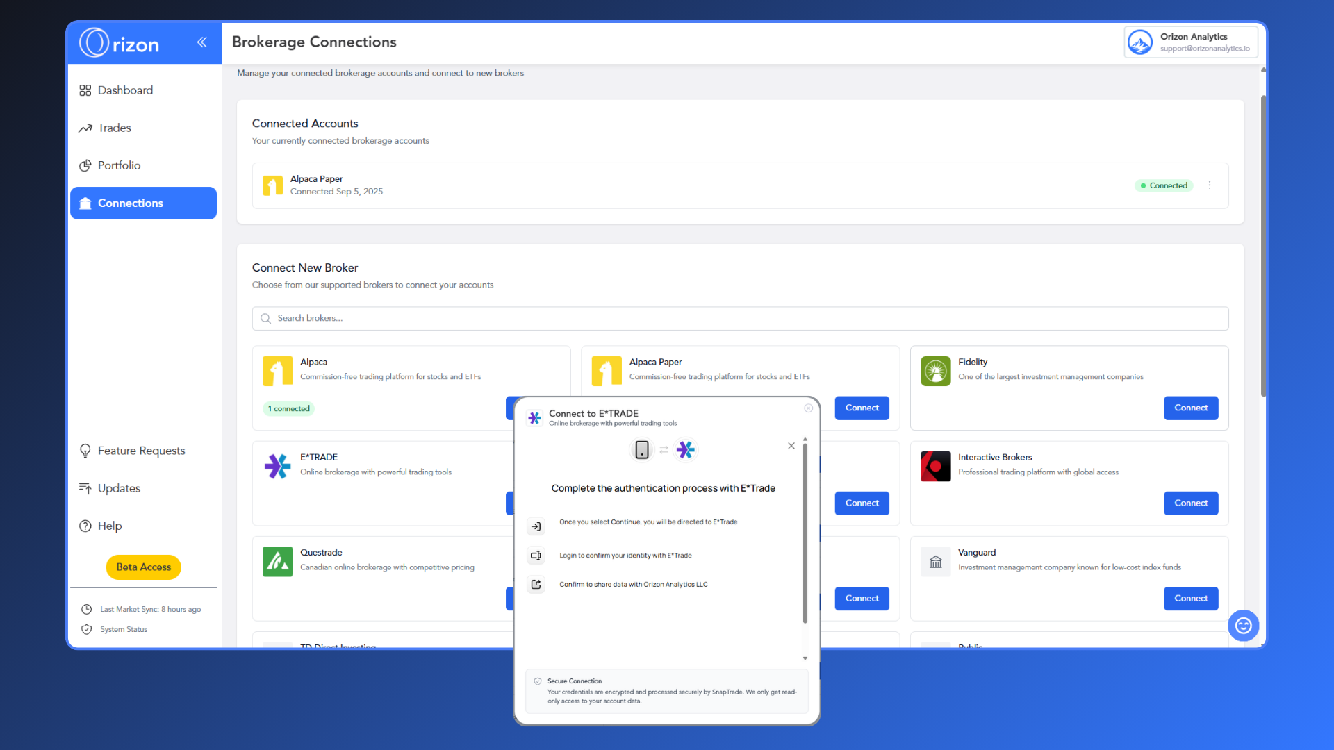
We're thrilled to announce a major upgrade to how you get your data into Orizon Analytics.
Connecting Your Brokerage
What: We've made it easier than ever to bring your portfolio data into Orizon Analytics by integrating with SnapTrade. You can now securely connect your brokerage account directly from the app, eliminating the need for manual data entry.
Why: This new feature simplifies your portfolio tracking and ensures your data is always accurate and up-to-date. By securely linking your brokerage account, you can instantly start analyzing your diversification, risk, and performance to make more informed decisions about your investments.
August 29th, 2025
New
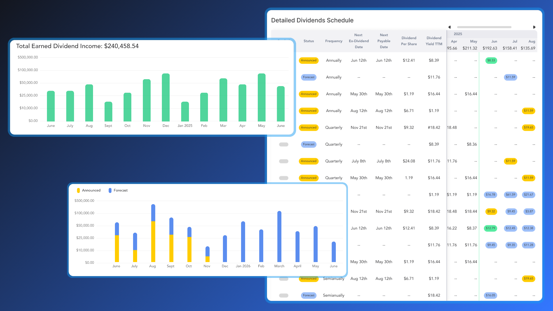
Dive deeper into your dividend strategy! We've launched a brand-new Dividend Income tab on the Portfolio page. It features powerful new tools designed to provide you with a clearer view of your dividend earnings and future income estimates.
Total Earned Dividend Income

What: This new graph provides a clear and intuitive view of your historical dividend earnings. It displays the total sum of all dividends you have earned to date and breaks down your income month-by-month. The graph is horizontally scrollable, allowing you to easily view your entire dividend history.
Why: You can now instantly see how much total dividend income you've earned and visualize the growth of your earnings over time.
New Dividend Summary Cards

What: We've introduced four new dividend cards to help you analyze your dividend income:
Trailing Twelve Months (TTM) Dividend Growth Rate: A card that provides a dynamic, real-time percentage comparison of your dividend income over the most recent 12-month period versus the prior 12-month period.
Total Estimated Income: A card that shows the combined sum of all your announced and forecast dividend income for a selected future date range.
Announced Income: A card that displays the total of your officially declared dividend income for a selected future period.
Forecast Income: A card that shows the total of your estimated future dividend income.
Why: These new tools provide valuable insights into your dividend performance and help you easily track confirmed payments, anticipate potential earnings, and assess the growth momentum of your income stream.
Estimated Dividend Income Date Range Selector
What: We've added a new date range selector to the dashboard, which allows you to filter and view your estimated, announced, and forecasted dividend income for upcoming periods. It includes predefined options like 1M, 2M, 3M, and 6M, as well as a custom range selector that only allows you to select future dates.
Why: This new tool gives you the flexibility to easily analyze your dividend projections for specific timeframes, helping you to plan for future cash flow with greater precision.
Estimated Monthly Income

What: This is a dynamic chart that shows you a month-by-month breakdown of your future dividend cash flow. Each bar is separated into "Announced" dividends (officially declared income) and "Forecast" dividends (estimated income). The graph starts with the next calendar month and extends to the following year, automatically updating as time passes.
Why: You can now easily visualize your estimated future cash flow, allowing you to plan ahead with confidence. The stacked view helps you differentiate between confirmed and projected earnings at a glance.
Detailed Dividend Schedule

What: This new, Detailed Dividends Schedule table is a comprehensive tool for tracking and planning your dividend income. It is split into two sections:
The Left Side provides a summary of each dividend-paying stock, including its status (Announced or Forecast), frequency, and key dates. This section remains frozen as you scroll.
The Right Side is a horizontally scrollable schedule of your monthly dividend payments. It shows the total monthly dividend from all your stocks and color-codes each individual payment to indicate if it is Earned, Announced, or Forecasted.
Why: This powerful table provides a complete view of your dividend-paying holdings in one place, from summary details to a detailed, interactive timeline of your payments. You can effortlessly track the status of upcoming dividends and analyze your income stream.